Text by Jahna Peloquin, as told by Richard Anderson
Photos by Chris McDuffieWith a whopping 14 local designers and five boutiques, this fall's Envision: Artopia is its biggest ever. The well-produced show by Ignite Models Inc. always packs the house, and last Friday at Graves 601 Hotel was no different. The production was accented with visuals from Anthem Heart, a live painting by Jesse Draxler and Christopher Park, a bumpin' soundtrack from DJ Shiek (accented by live electric violin), and a live hair show -
whew. (And did you know 100 percent of the silent auction proceeds benefit the Young Survival Coalition, a breast cancer research fund?)
After the show, we sat down and reviewed the lines,
Project Runway-style, with the ineffable Richard Anderson. Anderson definitely knows his fashion - the longtime Minneapolis resident has witnessed the ups and downs of local fashion over the years first-hand, and he's one of the most stylish men in town. He's like our very own Galliano. An interior designer by trade with his company Cherub Designs, Anderson made a name for himself making regular appearances on HGTV's
Decorating Cents; he's also an impeccable fashion stylist, and in some circles he's known as his hilariously campy drag alter-ego, Bitch Flowers.
Let's start the show.
 Jahna:
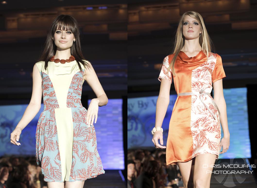
 This is YQY by Vivian, by Vivian Aronson. She’s a new designer from China.
Richard: I responded nicely to this. We really liked the references with the
coral. They were really cute dresses – I could see you wearing one or two of them!
J: Totally!
R: There were some dresses in the collection where the long hair covered some of the styling. They put a cute dress on a cute girl and it should’ve been fun. Perhaps with some better styling, it would've made more of an impact.
 J:
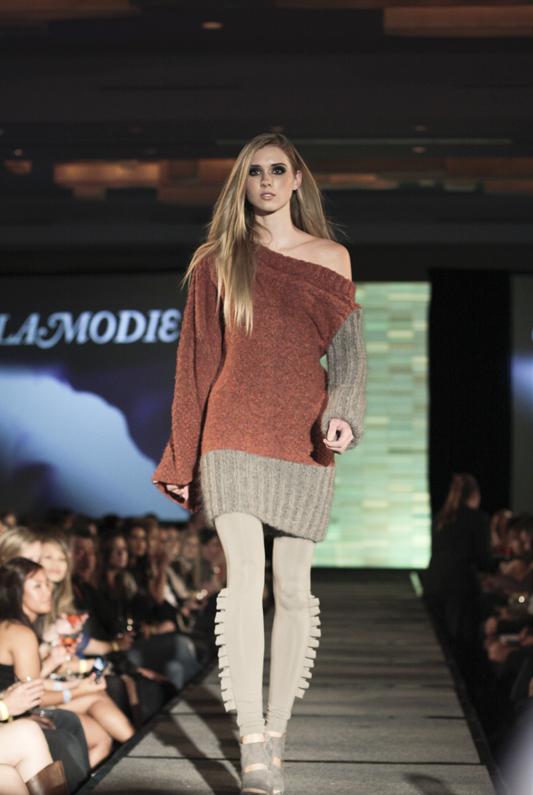
J: Next up we have a knitwear designer, Allilamodie. I've seen her stuff before, it's kind of cray-cray but there's some talent there. It's all hand-knit from what I understand.
R: I always love to see knits because it’s so hard to do knits. When I looked at the first look I thought, what a cute dress, but nix that black fabric! Where are we going with this? Is it daywear, is it nightwear? Put it with some brown leather over the knee boots, a Mongolian hat, make it look fall! It looks spring.
J: What about this jacket/denim look? I think it looks sort of dated.
R: I hate the jacket, and those pants are ill-fitting.
 J:
J: This one is actually pretty cute.
R: The pumpkin and taupe, loved it. Frickin' love it. Any girl would buy that sweater and wear it over jeans a cozy Sunday afternoon, or out at night with a great piece of jewelry.
J: Hit or miss is what I’m getting. Talent and skill for sure, but questionable taste level.
 J:
J: This is Kathryn V. by a recent grad, Kathryn Sterner. She's carried at Cliché.
R: I kind of like it. I like the ‘70s reference of the slouchy sweater and the
boots.
J: Yes, it's very wearable and smart. Very on-trend. She's really come a long way since I first saw her at SCENEaSOTA last fall.
R: But couldn’t you just die when they were holding those floral boutiques? That made no sense at all.
J: I thought it was kind of cute!
R: They’re women in daywear. I don’t get it. You’ve got the glasses, you’ve
got the cute jumper, but the flowers are distracting.
 R:
R: I think she’s got some good references here. The schoolgirl skirt with the pleats, and the sailor pants fit her beautifully.
J: Very well made. I'd wear those in a second.
R: But I think my biggest disappointment was the styling, throughout the show.
J: Apparently, each designer was responsible for his or her own styling.
R: We want to see it look more runway and less mall. I know we’re going for minimalist for jewelry this fall, but give us something to look at. And the hair is just wash and wear.
 R:
R: Oh, Russell Bourrienne! He continuously impresses me and he doesn’t get the credit he deserves. I love that he makes classic menswear fun. There were pieces like the plaid trench coat that we have seen, but with the exaggerated lapels. The zipper jacket, despite it being so many zippers, he took a basic bomber jacket and made it interesting, sort of gave it an art deco look. He took a classic peacoat and gave it those interlocking buttons.
 R:
R: The yellow coat is like ...what’s the movie with Madonna and Warren Beatty?
J: Dick Tracy. It's so you.
R: I want it so bad! It has that ‘60s London feel - all dolled-up dandies. I know he did his own styling, and he did it right. It looks masculine but fun.
 J:
J: Here's Amanda Christine. She sells her stuff at like 30 stores around the country.
R: You can tell. I can’t throw her under the bus. There’s good references there.
I’ve seen it before, but I like it. She adds her own twist. And I love shorts for fall. It’s well-done, and she uses good fabric.
 J:
J: This is Jenny Carle, another Cliché girl.
R: See, the plaid dress was cute. Then she threw the cheap-looking overlay on it. That’s when you need someone to come in and say, stop!
 R:
R: That taupe print dress, I thought of you immediately!
J: Yes, we used it for our fall shoot in l'etoile. It's adorable.
R: It’s a little bit
Mad Men but not quite. Love the fabric, it almost looks like upholstery, which I love. Almost a perfect dress.
J: The styling was great with the little crinoline and gloves.
R: Yeah, that gave it some runway appeal.
 J:
J: We're kind of skipping over the boutiques, but I always love what Cliché does with styling.
R: I did love the childlike construction paper Lady Gaga-esque crowns. And I really
loved the necklaces made from construction paper. I think some designers should
make those out of resin. It was playful silliness you could throw over a simple
dress. That was a retail store that said, we should do something more.
J: They made the accessories themselves.
R: I loved the presentation. That’s why we go to a fashion show - for something unexpected.
 R:
R: But this last look - the sweater with the holes in it with a bunch of tulle? It looks like Freddie Krueger went to the prom.
 J:
J: Who is this James Reilly? I've never heard of him before.
R: He’s kind of a friend of mine. I was hoping for more from him. Some of these pieces were pretty.
J: I thought it looked a little dated. Interesting, but dated.
R: Yeah, it looked like the ‘90s! That green dress with all the heavy rouching and cape and all the velvet... But the big kimono jacket, I could see some girls wearing that.
 R:
R: This looks like a dress that Daryl Hannah would have worn in 1995 with boots. Totally grunge.
J: But I can't tell if it's on purpose or not.
 J:
J: This is a Hmong designer who was in Voltage last year, PFT Couture by Pafoua Thao. I really liked what she did for Voltage and other shows in the past but I don't know what's happening here.
R: I know where she's going, she's trying to be really edgy. But the model looks like she’s overwhelmed. It should have been a knee length skirt or leggings.
 R:
R: Oh gosh, the crop top.
J: It's sort of a weird proportion, like it cuts off the model in a weird place. Did you know that's Raina Hein? She was the one on
America's Next Top Model.
R: That skirt is fun for Beyonce, or Bitch Flowers. That’s a stage skirt. Where would you wear that? The MTV Music Awards?
J: I think that's the point. It's pretty cool - the skirt, at least.
 J:
J: This is ArielSimone. She was recently in a show at New York Fashion Week with some
Project Runway alumni. I remember seeing her work last year and not liking it much, but it seems like she's coming a long way.
R: The first skirt seems too short - the proportion is off. And the necklace with the earrings is too much! The other skirt is totally cute and the print is fun, but the grey blouse just killed it. She needs something with color. Maybe she should have stolen the necklace off the other girl and thrown it on here.
 R:
R: That velvet thing...Oh my god. Brigette Nielsen would’ve worn that in the ‘80s
J: You would remember!
R: That was like, go to the club and look like a hooker. It just looks cheap – the
fabric, the cut is too short.
R: Then we have the Liza Minelli trapeze. Barbra Streisand in 1966.
J: I sort of liked the idea of it but somehow it got lost in translation.
R: And because she did the drop in the back, you can see the reverse of the fabric because she didn't line it. The print is kind of fun. Cut the sleeves off, line it, and maybe? But no jewelry, no hair - it just ended up looking frumpy.
 J:
J: This is one of my new favorites, Tender Cuts. It's by this young designer Emily Bryngelson.
R: I think it’s cute, it’s wearable. I love all this pumpkin everyone is doing. I
think the skirt is something you could buy now and wear ten years later. And that's a perfect blouse, don’t you love that?
J: Yes, it looks luxe yet youthful.
R: I love the grunge reference on the first look, the oversized boyfriend jacket. All of this stuff is totally cute. I like the colors, the jumper! And it's good, clean styling.
 J:
J: The corduroy jumper with the suspenders was one of my favorite pieces of the night.
R: It’s four season clothing, I love everything she did.
 J:
J: This is Sydney Ilten. She's better known for her feather accessories that she sells at Cliché.
R: It’s fun, I don’t know. I like that she threw those crazy leggings on that one look. But I don’t know if this stuff fits well. Maybe too big of pleats, too high up.
J: It looks kind of sloppy.
R: You’re right.
 J:
J: This is Kimberly Jurek's holiday line. I think she's calling her line K.Jurek now instead of kjurek couture.
R: I remember this coming down the runway. The rosette has been done and I don’t
think it should be done again. They were so big and stuck out so far, it’s like a
growth!
J: Without the rosette, though, they're very cute, luxe party dresses. Very wearable and retail-friendly.
 J:
J: I loved this look on the runway. The fabric was so gorgeous.
R: It’s very Halton from the ‘70s. The cut, the fluidity...it's great. Just take the rosette off! You could fit a family in one of those.
 J:
J: This is the holiday collection by Calpurnia Peach. I'm a fan of theirs.
R: But what's going on with this first look? It's like, I’m a sophomore and showing my first collection at the fashion institute. Where did they get off putting white pants with that? They started right with the top but the crinoline and pants...you don't want to be that girl at the party.
J: Yeah, it's very unlike them. Maybe they're trying to shake things up? I think the pants and top could've been cute worn with other things, just not together. And it's hard for tulle to not look cheap.
 R:
R: The blue dress is definitely cute. I could see you wearing that. The
print captivates me. What is that?
J: An owl. They do all their own original prints, you know.
R: What are the napkins hanging off her waist? It looked like pocket lining.
J: I see what they're going for but I feel like they do best with more edited looks. The froo-froo doesn't work. But I do appreciate the wood-grain print.
 J:
J: Now,
this was my favorite look of the night. Hands down.
R: Agreed. I love this one with the mice. I was like, they just redeemed themselves. A girl with a sense of humor would wear that. Isn’t it very Prada, like when she did lipstick and carnation prints - the pop art references?
 J:
J: Finally, Christopher Straub. This was a preview of his Spring 2011 line.
R: The hydrangena dress was really cute. This look came down the runway and I got
excited. It was well-made, unexpected, and I love the trapeze shape. This one is perfect.
J: Agreed, it's such a chic look and so unexpected coming from him. He said he designed the patterns himself.
 R:
R: But then it went downhill. The teal dress had potential but threads were hanging off. Then we’re back to the top with the exaggerated detail, and I get designers are doing the architectural thing, but skirt looked like dining room upholstery. I do love the petal shrug.
J: The petal work has sort of become Christopher's trademark. He does it well.
R: But the dress didn’t fit well, it wasn’t a good length, and I hated the belt.
 J:
J: Then we go to his gown.
R: I didn’t get it. I liked his attempt with the print top, but the skirt looked like
a prom dress. And then he put that big heavy purse with it. And the shoes were terrible.
 J:
J: More petals. This one is pretty cute.
R: I remember this coming down the runway and thought this could be fun, but the
raspberry corset was too much.
J: Yes, it's too extreme.
R: Maybe just with a belt. He’s known for the petal dress and he does it well.
J: It won him a challenge or two on
Project Runway, after all.

 Berg created a rainbow of cocktail dresses and gowns specifically for the event. The capsule collection opened with cocktail dresses in white, navy and dandelion yellow. They were fairly conservative designs compared to the majority of the collection, but each had understated details and design elements that separated it from the average cocktail dress.
 An asymmetrical cornflower blue wrap dress could also be worn as a light-weight coat. On its own, the translucent fabric and potentially plunging neckline (depending on how loosely the dress was worn), could be fairly risqué, despite the layers and gathers of fabric. But worn as an additional layer over another gown or dress, it would function as a fashion-forward look for the more conservative dresser.
 A voluminous cream sleeveless cape trailed a simple white dress and red lace waistband. Elements of the design were almost cocoon-like, and the cape hung down the model's back like dripping wings. It had an incredibly graceful effect. Though the red lace was stunning, it would be interesting to see this look belted with something that maintained its ethereal quality.
 An delicate one-shouldered dress in complimentary shades of green felt suited for Titania in A Midsummer Night's Dream. The dress was expertly sewn (in chiffon, no less), but even so, there were a few slight puckers of fabric. With a design such as this, anything that breaks the flow creates a distraction.
 The penultimate design, a dramatic magenta gown, recalled the gentle turns and folds of flower petals. The skirt and bodice were immaculately sculpted, and the color itself was incredibly rich. The exaggerated flowing sleeves were interesting and well-constructed, but the drama of the look limits the piece to the fashion brave. It would be too Dynasty for most women, but with only slight editing, it could become a far more wearable gown.
 The finale dress was a bouquet of colors. Flowers, hand-painted by local designer Max Lohrbach, blossomed on yards of silk that gathered and ruffled around the model. The result was stunning. One of Berg's signature design elements is a vertical gathering that cascades, uninterrupted, down the front of her gowns. However, this particular gown's shape would have been more dynamic if the horizontal line of the black waist band was unbroken.
 Styling by l'etoile's own Jahna Peloquin and hair and makeup by Charlie Brackney and the talented crew of Haus Salon hit just the right note of avant garde. The models from Vision Model Management were impeccable as always, even after changing into little black dresses to assault the hors dourves table. The event was understated and elegant, and raised enough funds to purchase a number of musical instruments for the Boys & Girls Club's American Guitar & Band Academy, including a new piano, drum kit, and more.


 The fashion kicked off with looks from Jenn Bratvold and accessories by Carrier Pigeon. Bratvold's collection included nods to schoolgirl style, English country dressing, and retro mod fashions. The designer clearly has a lot of great ideas, but needs to streamline her point of view. At times the collection felt jumbled, but a number of pieces were quite sharp and gave audience members a sense of the designer's potential.
 Kathryn V's segment opened with a ladylike dress that was heavily featured in one of the accompanying short films. Though the elbow-length sleeves and graceful scoop back conveyed a coy sexiness, the shirttail hem felt strangely out of place. The designer had better luck with separates, where she showed mix-and-match skirts, blouses and jackets. Playful baubles by Timmilynn Johnson accessorized the collection.
 Christine Carmichael of Carmichael Claith opened with a full-length one-shoulder gown in dramatic crimson. For the most part, the designer stuck with what she does best: ladylike pieces with a whiff of classic Brittania. The last three looks (despite an addition of a fun pinstripe menswear-inspired jacket complete with coattails) were all variations of the same olive party dress. It was a gorgeous look (the tea-length version is pictured above), but it was disappointing not to see more variety from an established local designer. Feathered and beaded accessories from Bionic Unicorn kept the styling from veering into the overly sweet.

 Finale designer Kevin Kramp continued along his path as the Twin Cities' most avant garde menswear designer. Though many of his styles are reasonably unisex, I couldn't ignore a pang of jealousy as the male models paraded down the runway. It would be a treat to see the fearless designer tackle womenswear. As has been the case in the past, Kramp's pieces were paired with accessories by Ferociter, a line also known for taking risks. Ferociter designer Aimee Dukes and Kramp continue to compliment one another's aesthetics.